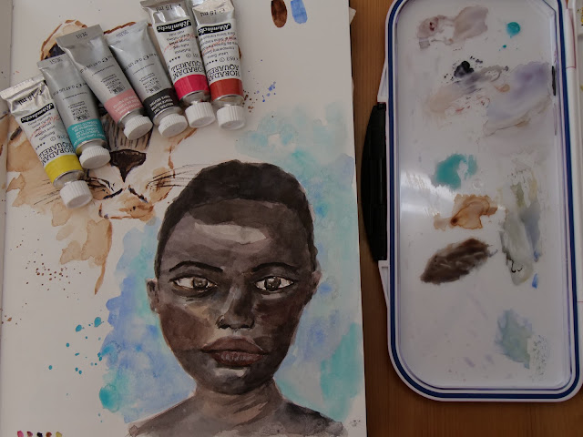
Setting a new watercolor palette
Setting a new watercolor palette
 |
| Setting a new watercolor palette |
I've been considering upgrading to professional watercolors for a while now. I have started watercolors in 2021 and mostly used Winsor & Newton Cotman watercolors so far, which is their student grade watercolors. I have also used some White Nights watercolors (professional quality). So why create a new palette?
First, I want to start building my collection of professional watercolor tubes, so that I have more flexibility in setting my palettes. This way I can use the super pigmented watercolors straight from the tube, put it on a big mixing space for larger pieces, or just curate my own palette. I also find that with bigger tubes you get a really nice quantity for less money, as you can usually fill (depending on how full you fill your pans) up to 3 full pans.
Also, I want to experiment with different colors and color mixes, and I think it is a great occasion to upgrade a few paints. I find it very refreshing to test out new colors now and then, as it sparks your creativity differently. Creating your own palette is also a very good way to get a little bit more into color theory and pigments, and start thinking more consciously about your color choices, instead of buying pre-curated palettes.
Last but not least, there were some sales on Winsor & Newton professional watercolors. I ended up buying from different brands, but seeing the sales was the trigger I needed to get into the process.
Choosing the colors
The first step, and the most complicated one, is to choose your colors. Dot cards are a really nice way to get a first feel for the watercolors, to test them for yourself and to make your selection. However, dot cards can add up to be quite expensive if you want to try out all brands. I decided to go only with the Schmincke Horodam Aquarell (super-granulating and normal ones), as they are quite affordable here (in Austria, Europe). Winsor & Newton are also really affordable, but I did not want to have too many swatches to make.
Once I had received the dot cards, I started swatching. And it took hours... And to be honest, I did not feel such a big difference between the paints. I mostly used the swatches to have a first look at the colors (even if I was quite timid with my colors and dod not do big swatches and gradients).
 |
| Swatching... |
Then comes the thinking part. I did have an unlimited budget, so I wanted to limit myself to a few colors only. I really like painting landscapes, and I wanted these colors to be with me when I went plein-air painting. So, I decided to stick with "safe choices" and add just a few "interesting" colors.
Here were my main criteria:
- more or less cool and warm primaries (with a bias towards earthy tones)
- transparent colors, single pigmented (to get the cleanest mixes as possible, and just to play with transparent watercolors in contrast with the opaque gouache)
The final palette
I decided on these colors from Schmincke:
- pure yellow for a transparent yellow (to replace the classical lemon yellow, even though the color is a little bit more on the warm side)
- ruby red, for this gorgeous pinky red. I think it will act similarly to alizarin crimson on the mixes
- helio cerulean for a saturated blue
- transparent ochre, to get this earthy yellow and get some more realistic mixes for my greens
- transparent sienna, a gorgeous earthy orange
- French ultramarine, for a deep blue with a lot of granulation (which makes wonderful effects with very wet paint)
- perylene green, for a darker color with a very interesting green undertone. I will not be using this one for my plein air, but only on my studio palette
 |
| Color selection for Schmincke Horodam Aquarell |
 |
| Granulating French ultramarine |
I also took three colors from Winsor & Newton, just acting on a whim! I took two granulating fun colors: potter's pink and cobalt turquoise light. i also took the neutral tint, as it has a nice warm undertone and would probably work really nice for monochromatic pieces. I find it more interesting than the usual lamp black or ivory black.
 |
| Color selection Winsor & Newton professional watercolour |
Swatching and playing
Once I received the colors, it was a matter of swatching them, and putting them in pans. I took the six Schminck on a Portable Painter mini for plein-air sessions, and replaced some of my white nights by my new colors on my studio palette. I then created small swatch cards for all of my palettes.
 |
| My palette swatches |
When I get new colors, I really like to take time to play and experiment with them. Usually, the first thing I do is just messing around with the paints, testing some color mixing, different watercolor techniques (blending, layering, gong wet-into-wet, etc.).
 |
| Messing around! |
I will then slowly start using them for some sketches and finally for some final paintings.
 |
| First sketches |
 |
| Plein-air with Portable Painter |
I feel like for each new supply, you need to give yourslef time to play with them, experiment, and find out how you prefer to use them.
I have made a Youtube video on setting up this palette, so don't hesitate to go check that out if you're interested!
I have not edited the colors on the pictures, and anyway, do not take them as any sort of reference as the look of the colors will change from one screen to another!

Comments
Post a Comment
Thanks for your comment, it will be posted as soon as I have reviewed it (for ethical and security reasons)!